Development Notes
Directory Variables
Used in common layout: /_resources/xsl/common.xsl
chat
Path to chat include
If empty, defaults to: /_resources/includes/_chat-empty.incshow-emergency-banner
If set to false, adds class 'hide-emergency-banner' to header
CSS styles hide the bannershow-subfooter
If set to false, the subfooter HTML will not be added
Used in interior: /_resources/xsl/interior.xsl
start-nav
Set this variable to the 'directory' where script will begin a crawl for nav.inc filestop-nav(unused?)
Defaults to: /_resources/includes/header-nav
If changing, do not include an extension (automatically adds the .aspx for published files)
Used for social media integration: /_resources/xsl/_shared/social-meta.xsl
Defaults:
og-image: (empty)og-site-name: Shoreline Collegetwitter-site: shorelinecc
Shoreline Redesign Notes (2020)
Homepage
The homepage update now uses a structure similar to interior pages. Each section can be turned on and off in the Page Properties. The Color Schemes also work the same. The Custom color scheme can be used for the areas that have custom code and require use of the full section—edge-to-edge—instead of being limited to the 1280px width container.
The homepage no longer uses any MultiEdit functionality.
The hero feature uses a Hero with Offset Image snippet, unique to the homepage.
Background Image
To update the background image, upload the image into a folder that has been set to use the Image Size Set: Hero (Offset Image) from the directory's access settings.
The image uploaded must be a minimum of 1200px x 1200px and will be resized automatically when uploading to a folder, such as /_resources/img/homepage/hero/. Note: It's recommended to upload your image from the Content > Pages area instead of while updating the default.pcf. You must manually publish all variations
of your image.
| Size | Suffix | Width | Height |
|---|---|---|---|
| Small | -sm | 480 | 300 |
| Medium | -md | 768 | 480 |
| Large | -lg | 800 | 1200 |
| XL | -xl | 1200 | 1200 |
| XXL | -xxl | 1200 | 850 |
To change out the picture, choose the image in the Build Responsive Picture Tag snippet of default.pcf and change the image to point to the -sm version of your new set of images. The benefit of this setup is that the image will adjust to the device viewed automatically. If these images are not all published, or do not exist, you may see broken images on certain devices.
Background Color and Image Position
To set the focal point of the background image, use the Focal Point dropdown. More
themes can be added to /_resources/ou/editor/select-lists/bg-offset-themes.json and more focal points can be added at /_resources/ou/editor/select-lists/bg-offset-focal.json.
- Hero theme:
-
- Wave (Primary), bg-offset-primary-wave
- Wave (Blue), bg-offset-blue-wave
- Wave (Yellow), bg-offset-yellow-wave
- Image focal point:
-
- Center, center
- Top, flex-start
- Bottom, flex-end
Hero Content
The hero content area is a WYSIWYG area that can be updated similar to normal editable
regions. There are two card themes to choose from for the style of the content box
itself. More themes can be added to /_resources/ou/editor/select-lists/bg-hero-content.json.
- Card theme:
-
- Light Bg / Normal Text, bg-light
- Primary Bg / White Text, bg-inverted
The circular images are managed using the Card with Round Image snippet. In the first column, link to a square image (recommended 400px x 400px) and be sure to set appropriate alt text.
The linked title expects a simple paragraph with one line of linked text. This will show below the photo on save. The link on the text will be used for the whole card.
This special Content with Green Background Image Overlay snippet is used with the Custom section theme. It loads the selected background using the lazy load method. (The background image purposely doesn't show on mobile devices.)
The TOC box creates a list of links with SVG images.
SVG Images
Each SVG image should be created using a viewbox of 0 0 50 50 and created as an individual source code asset. For consistency, use the naming format
"Homepage AOS Icon: AOSNAME" for new SVGs specific to this area. Also include a title tag with a value similar to what you would set in an alt tag.
Example of SVG include:
<svg version="1.1" class="svg-icon" xmlns="http://www.w3.org/2000/svg" xmlns:xlink="http://www.w3.org/1999/xlink"
                                                x="0px" y="0px"
viewBox="0 0 50 50" style="enable-background:new 0 0 50 50;" xml:space="preserve"><title>an open book</title><g> <path fill="#000000" d="M40,,33.652z"/></g></svg>
SVG Color
To change the SVG color, select the color dropdown. More colors can be added to /_resources/ou/editor/select-lists/svg-color.json.
- SVG Color
-
- No format (default), unformatted
- Primary (Green), primary
- Secondary (Yellow), secondary
- Link Blue, linkblue
- Bright Green, bright-green
- Orange, orange
Includes
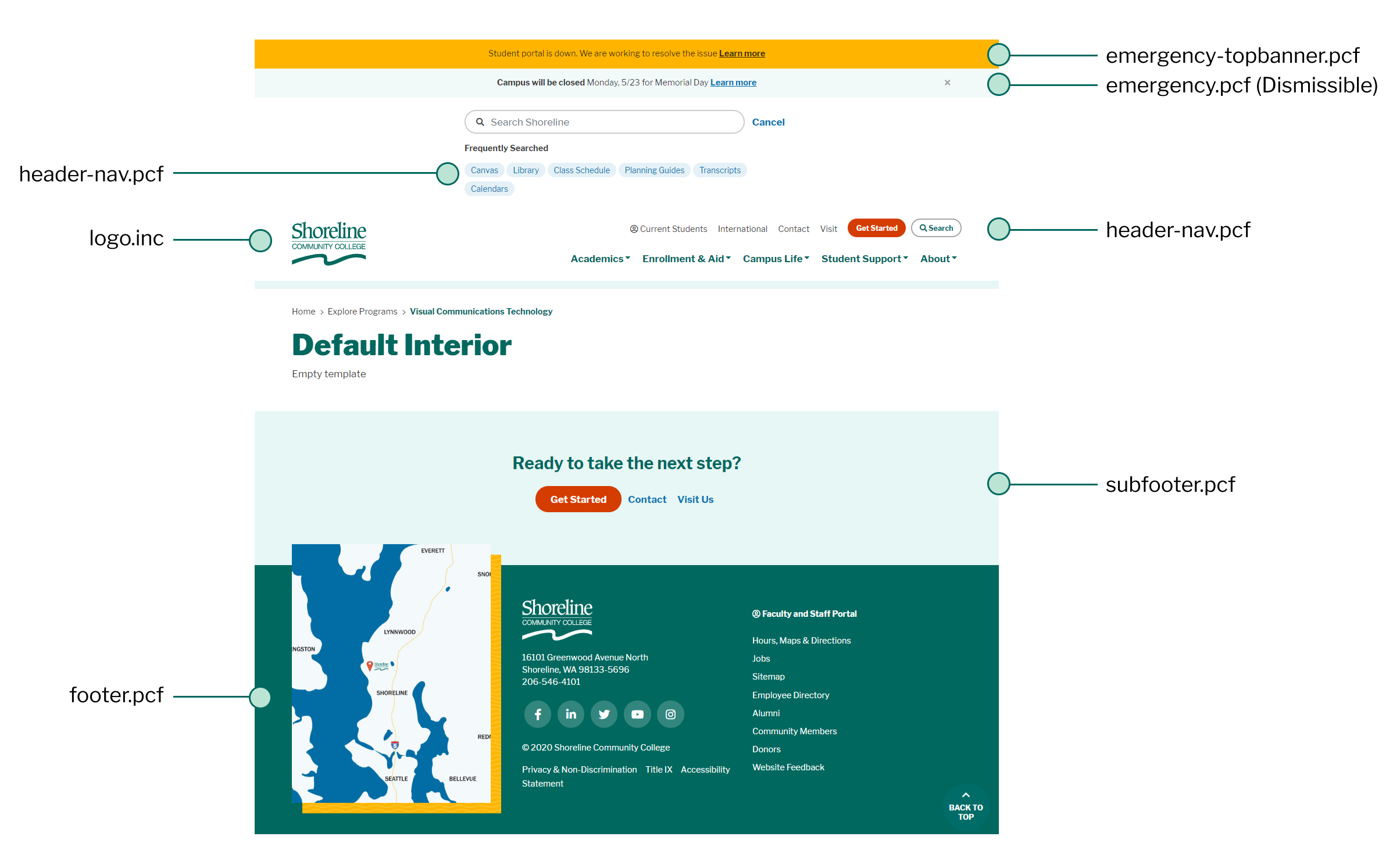
- A single dismissble alert can be set from emergency.pcf.
- Up to two static alerts can be set from emergency-topbanner.pcf.
To edit alert messages, the field must be enabled. Alert messages are edited using the Edit button similar to Main Content editable regions. Once you've enabled the alert(s) and edited the message, preview and publish the PCF to update the alert globally.
MultiEdit Options:
- Enable alert: on/off
- Color scheme:
- Red / Alert (Inverted)
- Yellow / Warning
- Primary Green (Inverted)
- Light (Light Grey)
Directory Variable Options:
- If
show-emergency-banneris set to false, neither emergency banner type will show on pages for that directory.
- Frequent Searches are manually maintained in header-nav.pcf.
- No custom HTML allowed, use an unordered list of links to manage number of frequent search links. (No limit.)
- Quick Links (Audience links) are maintained in header-nav.pcf.
- Minimal custom HTML allowed to allow for inline icons using FontAwesome.
- Quick Links Button ("Apply") is managed using header-nav.pcf.
- No custom HTML allowed. Modified text or link only.
- The megamenu navigation is managed using header-nav.pcf.
- Menu Title column—text only; the text shown in the megamenu prior to opening the dropdown content.
- Dropdown Links column—this editable region is very flexible and works similar to normal
editable regions in PCFs. Snippets and custom classes are allowed.
- Column 2 Links—the unordered list in column 2 will automatically wrap into two columns on preview.
- Column 3 Links—if empty (no text or single space only), this area will add a class
of
no-border
The logo.inc consists of the SVG code for the Shoreline CC logo.
The subfooter is managed in subfooter.pcf.
Directory Variable Options:
- If
show-subfooteris set to false, the subfooter will not show on pages for that directory.
- Social links can be edited in footer.pcf.
- The text must match a FontAwesome 5 Pro brand icon. E.g. facebook uses the fab fa-facebook icon. View available brand icons. If an icon doesn't seem to be working, check the release date for that icon (must not be later than the current version implemented on this site.)
- Footer's Column 2 and Column 3 links can be edited in footer.pcf.
- The first link in the Column 3 list of links is always styled differently and must be configured in the footer.xsl.
- Footer Map can be edited in footer.pcf.
- Recommended: saved as 500px x 500px using type png.
- Footer map uses a background but will show up as a dependency publish if added while updating footer.pcf.
- Screen reader text and link—link will be the target page when map is clicked.