Snippet Glossary
Welcome to the Snippet Glossary. This resource is intended to be a visual reference that displays how Snippets will look and operate on the page.
- 50/50 Two Column Text Snippet
- 50/50 Two Column Text Snippet (Reverse Layout on Mobile)
- Three Column Text Snippet
- Three Column List Snippet
- Accordion Snippet
- Image with Overlay Snippet
- Contact Info Two Column Snippet
- Contact Info One Column Snippet
- Courses
- Button Snippet
- Single Event Snippet
- Multiple Events Snippet
- News Feed Snippet
- OmniUpdate Support
- Green line on Left Snippet
- Two Column Snippet with 1/3 to 2/3 Width Ratio
- Two Column Snippet with 2/3 to 1/3 Width Ratio
- Two Columns with Quote on Right Side
- One Column Quote
- Quote - Testimonial Slider
- Rectangular Announcement with Button
- Square News/Announcement
50/50 Two Column Snippet
Insert Column One Content.
This is the first (or left-side) column of a two-column snippet where content can
be placed.
In the page's responsive design, this column will scale down and be placed above the second(or right-hand) column.
Insert Column Two Content.
This is the second (or right-side) column of a two-column snippet where content can
be placed.
In the page's responsive design, this column will scale down and be placed under the
first (or left-hand) column.
50/50 Two Column Snippet (Reverse Layout on Mobile)
This is the first (or left-side) column of a two-column snippet where content can be placed.
In the page's responsive design, this column will scale down and be placed under the second (or right-hand) column.
This is the second (or right-side) column of a two-column snippet where content can be placed.
In the page's responsive design, this column will scale down and be placed above the first (or left-hand) column.
Three Column Snippet
Insert Column One Content.
This is the first (or left-side) column of a three-column snippet where content can
be placed.
In the page's responsive design, this column will scale down and be placed above the second (or middle) column.
Insert Column Two Content.
This is the second (or middle) column of a three-column snippet where content can
be placed.
In the page's responsive design, this column will scale and be placed under the first
(or left-hand) column
Insert Column Three Content.
This is the third (or right-side) column of a three-column snippet where content can be placed.
In the page's responsive design, this column will shrink down and be placed under the middle column.
Three Column List Snippet
- Replace content when a bulleted list is needed.
- This is the first (or left-side) column of a three-column snippet where content can be placed.
- To add a bullet, simply hit the "Return" key.
- This is the second (or middle) column of a three-column snippet.
- In the page's responsive design, this column will scale down and be placed under the first (or left-hand) column
- To add a bullet, simply hit the "Return" key.
- This is the third (or right-side) column of a three-column snippet.
- In the page's responsive design, this column will scale down and be placed under the middle column.
- To add a bullet, simply hit the "Return" key.
Accordion Snippet
Aenean vel pharetra diam. Morbi vitae dolor in elit viverra fermentum vel in diam. Nulla interdum magna vel sapien vehicula dignissim. Pellentesque dignissim pulvinar. Quisque quis justo quis velit sodales tempor.
Aenean vel pharetra diam. Morbi vitae vel in diam. Maecenas in vestibulum sapien. Nulla sapien vehicula dignissim. Pellentesque dignissim pulvinar. Maecenas sollicitudin massa a consequat tincidunt.
Aenean vel pharetra diam. Morbi vitae dolor in elit viverra fermentum vel in diam. Nulla interdum magna vel sapien vehicula dignissim. Nam blandit felis sed luctus molestie. Maecenas sollicitudin massa a consequat tincidunt.
Aenean vel pharetra diam. Morbi vitae dolor in elit viverra fermentum vel in diam. Maecenas in vestibulum sapien. Nulla interdum magna vel sapien vehicula dignissim. Pellentesque vestibulum ac est dignissim pulvinar. Sed orci sapien, fermentum dictum consequat posuere, tincidunt vel dolor. Quisque quis justo quis velit sodales tempor. Nam blandit felis sed luctus molestie. Maecenas sollicitudin massa a consequat tincidunt.
Aenean vel pharetra diam. Morbi vitae dolor in elit viverra fermentum vel in diam. Pellentesque vestibulum ac est dignissim pulvinar. Quisque quis velit sodales tempor. Maecenas sollicitudin massa a consequat tincidunt.
Use this snippet to provide additional content to pages without creating exceedingly long Web pages.
Image with Overlay Snippet
Button Snippet (left and right justified)
Contact Info Two Column Snippet
Add your content here to match the height of the contact info to the right.
Contact Info One Column
Contact Us
Advising ServicesFOSS (5000) Bld., Room 5229
Hours
8 a.m. - 5 p.m.
8 a.m. - 4:30 p.m.
Courses
Resource Unavailable
We're sorry, the resource you were attempting to access is currently unavailable
if you need additional assistance, please submit a ticket on the Shoreline Support Center.
Single Event Snippet
Transfer Planning
Tuesday, January 20
4:00pm - 5:00pm
Building | Room 101
Multiple Events Snippet
News Feed Snippet
Under Construction - Consulting with OmniUpdate
Aenean Euismond Bibendum
Aenean Euismond Bibendum
Duis nec consequat dui. Praesent gravida diam at ex pharetra porta. Vivamus at nisi massa. Nam porta urna a dui
Green Line on Left Snippet
This creates two columns. In the right column is an area with a green border on the left. This acts as a way to "call out" an image or information.
Place your content here
Place your content here
Two Column Snippet with 1/3 to 2/3 Width Ratio
Insert Column One Content. This column is 1/3 the width of the page.
This is the first (or left-side) column of a two-column snippet where content can
be placed.
In the page's responsive design, this column will scale down and be placed above the second(or right-hand) column.
Insert Column Two Content. This column is 2/3 the width of the page.
This is the second (or right-side) column of a two-column snippet where content can
be placed.
In the page's responsive design, this column will scale down and be placed under the
first (or left-hand) column.
Two Column Snippet with 2/3 to 1/3 Width Ratio
Insert Column One Content. This column is 2/3 the width of the page.
This is the first (or left-side) column of a two-column snippet where content can
be placed.
In the page's responsive design, this column will scale down and be placed above the second(or right-hand) column.
Insert Column Two Content. This column is 1/3 the width of the page.
This is the second (or right-side) column of a two-column snippet where content can
be placed.
In the page's responsive design, this column will scale down and be placed under the
first (or left-hand) column.
Two Columns with Quote on Right Side
Lorem ipsum dolor sit amet, consectetur adipiscing elit.
Begin by typing a quote. Once the quote is done.
—Quote Author
One Column Quote
Begin by typing a quote. Once the quote is done, you can rejoice.
—Quote Author
Quote - Testimonial Slider

Name“Quote1”
Title
Name“Quote2”
Title
Rectangular News/Announcement with Button
Aenean Euismond Bibendum
Duis nec consequat dui. Praesent gravida diam at ex pharetra porta. Vivamus at nisi massa. Nam porta urna a dui
Square News/Announcement
Aenean Euismond Bibendum
Table (Simple)
| Head | Head | Head |
|---|---|---|
| Subject 1 | Subject 2 | Subject 3 |
| Subject 1 | Subject 2 | Subject 3 |
| Subject 1 | Subject 2 | Subject 3 |
| Subject 1 | Subject 2 | Subject 3 |
| Subject 1 | Subject 2 | Subject 3 |
Table (Pinned)
First column is locked. Right click a table cell to select deletion of a row or column.
| Film Title | Released | Studio | Budget |
|---|---|---|---|
| Frozen | 2013 | Disney | $150,000,000 |
| Toy Story 3 | 2010 | Disney Pixar | $200,000,000 |
| Minions | 2015 | Universal | $74,000,000 |
Table (Responsive Stacked)
Right click a table cell to select deletion of a row or column in order to size the table according to your needs.
| Film Title | Released | Studio | Budget |
|---|---|---|---|
| Sources: Wikipedia & Box Office Mojo. Data is current as of September 1, 2015. | |||
| Frozen | 2013 | Disney | $150,000,000 |
| Toy Story 3 | 2010 | Disney Pixar | $200,000,000 |
| Minions | 2015 | Universal | $74,000,000 |
Tabs Snippet
Tab 1 -- Lorem ipsum dolor sit amet, consectetur adipiscing elit. Donec dictum nisi arcu, vitae tempus nisl mattis ut.
Tab 1 -- Quisque sollicitudin ex quis sapien imperdiet, a ultricies elit laoreet. Duis nec consequat dui lorem.
Tab 2 -- Lorem ipsum dolor sit amet, consectetur adipiscing elit. Donec dictum nisi arcu, vitae tempus nisl mattis ut.
Tab 2 -- Quisque sollicitudin ex quis sapien imperdiet, a ultricies elit laoreet. Duis nec consequat dui lorem.
Tab 3 -- Lorem ipsum dolor sit amet, elit. Donec dictum nisi arcu, vitae tempus nisl mattis ut. Tab 3 -- Quisque sollicitudin ex quis sapien imperdiet, a ultricies elit laoreet. Duis nec consequat dui lorem.
Tab 4 -- Lorem ipsum dolor sit amet, consectetur adipiscing elit. Donec dictum nisi arcu, vitae tempus nisl mattis ut.
Tab 4 -- Quisque sollicitudin ex quis sapien imperdiet, a ultricies elit laoreet. Duis nec consequat dui lorem.
Tab 5 -- Lorem ipsum dolor sit amet, consectetur. Donec dictum nisi arcu, vitae tempus nisl mattis ut. Tab 5 -- Quisque sollicitudin ex quis sapien imperdiet, a ultricies elit laoreet. Duis nec consequat dui lorem.
Twitter Feed Snippet
Simply insert the proper Handle before the "@" symbol.
Image With Caption

Title H3
“Lorem ipsum dolor sit amet, consectetur adipiscing elit.”
Two Images With Captions
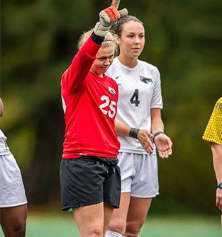
Image dimensions: Left Image should be no wider than 644 pixels by any height.
Right Image (one-column image) should by no wider than 313 pixels by any height.
Two Column Video Overlay Image with Caption Snippet

Title H3
“Lorem ipsum dolor sit amet, consectetur adipiscing elit.”
Kerry Fields ‘16, Soccer
Video with Caption Below
Title
“Lorem”
Name, Title