Identity Guidelines
This identity guide has been provided to help ensure the correct and consistent use of Shoreline Community College’s identity system. In addition, this guide also answers the key questions that make up our identity platform, including who we are and what we stand for. This document may be updated by the Communications and Marketing department as needed to include additional recommendations or examples of communications pieces used by the College.
Logo Guide
The logo is the primary graphic expression for the college. Correct usage of this
mark is essential to
establishing a unified identity system.
Reproduction of the logo must always be done using the approved digital art files provided by the Communications and Marketing department.
Logo Versions
Primary Logo with Tagline
This is the primary version of the logo and should be used whenever possible.
![]()
Alternate Logo with Tagline
This is the secondary version of the logo and should be used in cases where the layout does not accommodate the primary logo.
![]()
Standard Logo
This is the tertiary version of the logo and should be used only when the tagline versions cannot be accommodated or are not appropriate for a particular use.
![]()
Logo Colors
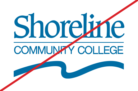
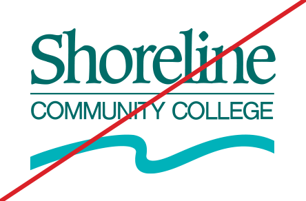
The Shoreline Community College logo has limited color uses. The only appropriate colors that the logo may appear in are full color (PMS 329), black, and reverse white.
![]()
The full color logo should appear in all full-color applications. The logo should only appear in “Shoreline Green.” For color specifications see Color Palette guide.
![]() The black version should be used only when color printing is unavailable or when a
hard contrast is needed for the identity to be visible.
The black version should be used only when color printing is unavailable or when a
hard contrast is needed for the identity to be visible.
![]()
The reverse white version should be used on backgrounds where the color or black versions do not provide enough contrast.
Minimum Size
There are no standard sizes for the Shoreline Community College logo. Therefore, scale should be defined by the available space, aesthetics, function, and visibility for any given layout. However, a minimum size has been determined to protect the legibility and integrity of the logo in all applications.
![]()
![]()
Minimum Clear Space
The minimum clear space is the area surrounding the logo that must be kept free of competing text or graphic elements. Leaving space around the logo ensures that it will stand out appropriately and that other words or graphics will not appear to be part of, or “locked up” with, the logo.
![]()
![]()
![]()
Logo Usage
The following images represent correct uses for the logo based on the guidelines provided in this section.
This usage guide applies to all of the approved versions of the logo.
Correct
Use color version of logo in all full-color applications.
Use the color or black logo only on a background lighter than 30% value.
Use the color logo over photos with simple, bright backgrounds.
Use the white logo over approved colors in the palette.
Use the white logo only on a background darker than 30% value.
Use the white logo over photos with simple, dark backgrounds.
Incorrect
Do not use non-approved colors for the logo.
Do not use multiple colors in the logo.
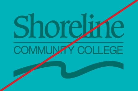
Do not use color or black version of logo on a background that is darker than 30% value.
Do not rotate, skew or distort the logo in any way.
Do not use effects such as drop shadow or glow.
Do not outline or add a stroke around the logo.
Do not stretch or change the proportions of the logo.
Do not place the logo on a complex background.
Do not disassemble or alter any part of the logo.
Logo with Department Name
Each department at Shoreline Community College should have a logo lock-up that is consistent with the following guide. For short department names (three words or less), the One Line Lock-up should be used. For longer department names (four words or more), the Two Line Lock-up should be used. The line break for a two line lock-up should occur directly before or after an ampersand. If an ampersand is not present, the line break should appear approximately half way through the name. The digital template should be used when developing new lock-ups.
This template is based on a 1" tall logo and uses Helvetica 65 Medium at 19 pt. size and 23 pt. leading.
One Line Lock-up
![]()
![]()
Two Line Lock-up
![]()
![]()
The following College areas are exceptions and have their own approved logos for limited applications:
- Athletics
- Foundation
- Alumni Relations
- Associated Student Government
- Nursing (for pins)
- Nursing Assistant Certified (for pins)
- The Honors College at Shoreline
- Cooperative preschools
Email Signature
Instructions:
- Click the box below to copy signature format
- Paste signature into your Outlook email signature
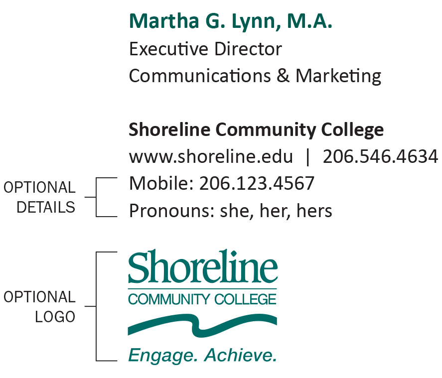
Name, Degrees
Title
Department
Shoreline Community College
www.shoreline.edu | 206.546.4101
Mobile: 206.123.4567
Pronouns: she, her, hers
![]()
Not looking quite right?
Download as .rtf or for Mac
Name
- 11 pt Calibri Bold
- Color: Hex #00685E
- If including academic credentials, use periods and separate by commas.
Title
- 10 pt Calibri Regular
- Color: Black
Shoreline Community College
- 10 pt Calibri Bold
- Color: Black
Website & Phone Number
- 10 pt Calibri Regular
- Color: Black
- Double space, pipe, double space between website and phone number
Optional Details
Up to two lines of text may be added beneath the website and phone number to accommodate either secondary contact information (if needed) or personal pronoun preferences.
Optional Logo
1" wide color logo The use of any other logos, such as co-branded partnerships, must be approved by the president (e.g. automotive manufacturers).
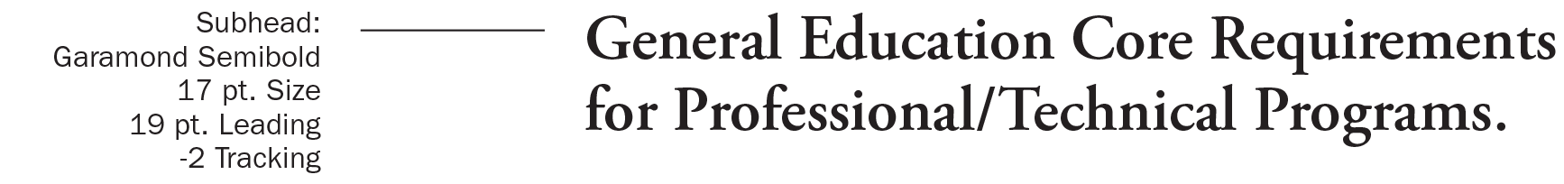
Typography Guide
The appropriate use of typography is integral to the Shoreline Community College identity system. The specified typefaces help convey a tone and character for the school that is optimistic and welcoming to all students. When applied consistently, the use of typography helps to unify the college’s communications and give messages a distinct voice.
Type Families
Franklin Gothic is the primary typeface and should be used in the specified weights and their italic equivalents for all communications.
Garamond is the secondary typeface and should be used in the specified weights and their italic equivalents in instances when a formal quality is needed that is distinct from Franklin Gothic.
The recommended version of Franklin Gothic is ITC Franklin Gothic and the recommended version of Garamond is Adobe Garamond.
In instances when the primary and secondary typefaces are not available, Calibri should be used as a substitute for Franklin Gothic and Cambria should be used as a substitute for Garamond.
Primary Typeface

For use in body copy as well as in subheads and subheads at larger point sizes.
For use in headlines and subheads.
For use in headlines or for use within body copy to give emphasis.
Use of this weight should be limited but it may be used to give extra emphasis at large point sizes.
Secondary Typeface

For use in body copy, subheads and headlines.
For use in headlines and subheads.
For use within body copy to give emphasis. This weight is not recommended for use in headlines or subheads.
Alternate Typefaces
Calibri Regular and Bold: For use when Franklin Gothic is unavailable. Recommendations for usage should follow equivalent weights of Franklin Gothic.


Cambria Regular and Bold: For use when Garamond is unavailable. Recommendations for usage should follow equivalent weights of Garamond.


Type Specifications and Examples of Usage
The examples shown demonstrate the following type specifications recommended for usage.
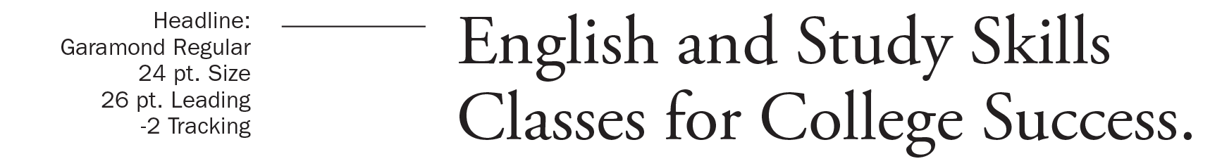
Letter spacing headlines and subheads:
- For Franklin Gothic 14 pt. size and larger, set tracking to -3.
- For Garamond 14 pt. size and larger, set tracking to -2.
Letter spacing body text:
- For Franklin Gothic between 7 pt. and 14 pt. size, set tracking to +3.
- For Garamond between 7 pt. and 14 pt. size, set tracking to 0.
Line spacing:
- For body text between 7 pt. and 14 pt. size, set leading to 120% of point size at a minimum.
- For headlines and subheads 14 pt. size and larger, set leading to 110% of point size at a minimum.
Franklin Gothic


Garamond
Color Palette
The use of color is a key component in helping to distinguish Shoreline Community College’s identity system. The primary and secondary color palettes reflect the greens and blues inherent to the surrounding natural environment and are expressed in bright and vibrant tones that communicate the positive, diverse, and exuberant characteristics of the college. In addition, the tertiary colors help to complement the primary and secondary colors.
Primary Color
The primary color should be used as the dominant color in a layout. One or more secondary
colors
should also exist in every layout in order to maintain the integrity of the identity.
Tertiary colors may be used additionally to provide an accent or show emphasis where
needed.
Shoreline Green
Pantone: 329C
C=100, M=14, Y=60, K=49
R=0, G=104, B=94
HEX: 00685E
Secondary Colors
Dark Blue
Pantone: 3015C
C=100, M=35, Y=3, K=21
R=0, G=98, B=155
HEX: 00629B
Light Blue
Pantone: 7466C
C=86, M=0, Y=32, K=0
R=0, G=176, B=185
HEX: 00B0B9
Light Green
Pantone: 361C
C=77, M=0, Y=100, K=0
R=67, G=176, B=42
HEX: 43B02A
Tertiary Colors
Golden Yellow
Pantone: 7549C
C=0, M=22, Y=100, K=2
R=255, G=181, B=0
HEX: FFB500
Orange
Pantone: 1665C
C=0, M=79, Y=100, K=0
R=220, G=68, B=5
HEX: DC4405
Color Tints
The use of brand color tints should be limited. However, when tints are used they should be no lighter than 50% of the original color in order to maintain richness and depth.
| 100% | 90% | 80% | 70% | 60% | 50% |
| 100% | 90% | 80% | 70% | 60% | 50% |
| 100% | 90% | 80% | 70% | 60% | 50% |
| 100% | 90% | 80% | 70% | 60% | 50% |
| 100% | 90% | 80% | 70% | 60% | 50% |
| 100% | 90% | 80% | 70% | 60% | 50% |
Photographic Style
Photography is an essential tool for communicating the many narratives at Shoreline Community College. Using our identity platform as a foundation, the following photo style guide is intended to enhance our story and communicate our values.
The style direction listed in this section provides specific guidelines for directing photo shoots or selecting the appropriate photos from stock photography sites.
Styling
- Subject has a naturalistic feel that is optimistic and engaging
- Bright, warm lighting
- Shallow depth of field with foreground or background environment appearing soft (allows viewer to feel like they are part of the photo)
- Asymmetric framing is recommended, but not prohibited • Photo should communicate positivity, inclusivity, and collaboration
Subject
- Subject(s) should always appear fully engaged with another person or an activity
- Subject(s) should appear active, not passive
- Subject(s) should not look at the camera, except in instances where an individual or group has been personally identified (i.e. a basketball team photo, a featured faculty member, etc.)
Examples
Student Portrait
These images portray specific individuals who are actively engaged with other people or activities


Faculty Portrait
These images portray faculty who are actively collaborating with one or more students.


Student Groups
These images portray acts of student bonding and collaboration. Though groups may be larger than three people, the primary focus should be on just one to three students within the group.


Campus
Campus imagery should appear active and maintain a depth of field.


Athletics
The Shoreline Community College Athletics department has its own distinct logo and colors which should be used for all Athletics gear and collateral.
These elements are intended to distinguish the college in competitive sports uses, such as team uniforms, gym facilities, fan gear, or advertising.
In addition to the Athletics department, the dolphin mascot and green/gold color palette may also be used in some non-athletic contexts, such as bookstore merchandise and apparel, or some student activities materials.
The Athletics logo, mascot, and colors should not be used on college-wide official documents, such as letterhead, name badges, or diplomas.
Logo
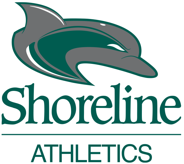
Colors
Athletics Green
Pantone: 7484C
C=91, M=14, Y=78, K=60
R=0, G=87, B=63
HEX: 00573F
Athletics Gold
Pantone: 7409C
C=0, M=31, Y=100, K=0
R=240, G=179, B=35
HEX: F0B323